


1. Single Version of the Truth
Information is a source of learning. But unless it is organised, processed, and available to the right people in a format for decision making, it is a burden, not a benefit. (William Pollard).
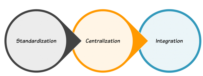
Standardization; The first step to helping decision makers work more efficiently is to standardize the data. Make sure you are collecting everything in the same way week after week. Simple things like player names can catch you out. For example are you collecting full names John Carr or J. Carr or John C. Avoid these mistakes at all costs!
Centralization; Does access to your data rely on just one person? What happens if they aren’t available? Don;t worry you are not alone. According to the SAUS survey some data is dependent upon one person in at least 90% of teams. Can you make your data available to the people who needed it when they need it?
Integration; There is nodoubt that more ball actions and physical data is being collected than ever before, but how often do different datasets talk to each other. Integration is key in being able to reference injury reports with GPS, Scouting reports with ticket sales and so on. Even if you operate at a lower level how can you make all your data talk to each other?
 2. Clear KPI’s
 2. Clear KPI’s
A dashboard must only display data that leads to action. Before you create your dashboard, identify your Key Performance Indicators (KPIs). The entire purpose of a performance analysis dashboard is to provide comprehensive insight about the KPIs its tracking — in as little time as possible.
Having an effective performance analysis dashboard requires metrics to be straightforward and easily readable. I would strongly suggest that the dashboard design employs basic charts and graphs with key numbers clearly highlighted for the user to review. This will ensure that the viewer gets the “full picture,” as well as a bottom line statistic for interpretation.
3. Customization and Interaction
 Remember, one size doesn’t fit all. Even users in the same department may want to see different data, or just view their data in a different format. Think about how defence and attack coaches may want to see things from different perspectives.
An effective dashboard lets users customize the data they see on their dashboard, along with the layout. It lets them interact with the data displayed in the dashboard. Rather than create multiple dashboards for multiple users, give them a single dashboard that they can customize. This is possible in Excel (without a decent level of knowledge), but tools like Qlikview and Tableau are becoming much more accessible and allow for a lot of this customization to happen seamlessly.
4. Minimize Noise
Some analysts make the mistake of cramming as much data as possible into a dashboard. This only distracts the users and weakens the dashboard’s effectiveness. While all of the data may be important, it becomes overwhelming when crammed into a single dashboard. Be selective. Also read this
Still to this day this is one of my favourite examples of the power good Data Visualization can make.
5. Offer Drilldowns
This step allows pack more punch with your overall Dashboard design. A dashboard gives users a high-level view of their data, but it must also let them drill-down to more details as necessary. For instance, if your dashboard displays high-level KPI’s, it should also let the user drill down and see where events happened, what players were involved, how does that compare to recent weeks, or seasons gone by.
6. Use Imagery
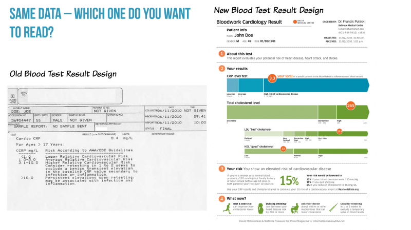
 Appropriate images require relatively little processing because they fit with the message. Showing people meaningful, content-based visuals, as opposed to text, lessens their cognitive exertion and improves overall experience. For numerous other examples of how visual design affects our brain’s processing capabilities, see Chabris and Kosslyn (2005).
Additionally, images often allow us to explain, simplify, or expand concepts in ways that are very difficult to do (if even possible) with text—or even with spoken words. Levie and Lentz (1982) looked at 46 experiments comparing pictures included with text, or text used alone, and found that 45 of the studies—all but one—showed that including pictures improved memory or comprehension. In one case, a group following directions in text illustrated with diagrams did an amazing 323% better than a group following the same directions without the illustrations.
7. Real Time
 Suppose the dashboard in your car only displayed day-old data. Would that help you at all? Of course not! You don’t want to know how much petrol you had a day ago. You want to know how much you have right now!
Many teams make this mistake with their dashboards. They confuse the concepts of a report and a dashboard. A report shows historical data. A dashboard displays real-time data. It shows you what’s happening in your business at that very moment. If the information presented by the dashboard cannot be used to correct current problems, or improve your current situation, it’s not a dashboard. It’s a report.


